Laurel Gitlen gallery is set up so when you first enter, you are immediately faced with a wall, but to the left there is a opening that leads to the 'main' gallery. The main gallery is simply a large rectangular room with wall space on four sides for exhibits. But there is also an additional, nondescript doorway for the curious souls that leads into brick-walled corridor that leads to one more back gallery.
This setup makes the space itself fun - there is real sense of discovery that makes the space itself exciting. Which opens up multitudes of exciting possibilities of site-specific artworks or exhibitions. At the same time, an eccentric space such as this can be a double-edged sword. It's certainly possible that the space itself takes more attention than the works it's supposed to support. Possibilities can be limiting, and limitations can lead to new possibilities.
I am interested in the literalness of the wall - like, it's there, you can't walk through it. It's so literal that you can't even see through it (I'm sorry, I can't help myself. BTW, I got a good kick out of the fact Anissa Mack's PR says she is working against literalness of the language, while Zipora Fried's PR asserted she is working against language's ambiguous nature).
In all seriousness though, It is quite interesting how the wall defines the space as it cuts up and divides the gallery. Artworks that defines and changes the meaning of the space it's places in - like Richard Serra's-, or artworks that changes itself with space it's created in - like Sol LeWitt's- will be particularly interesting in this space.
If it was up to me, I will have to curate or create body of works that fits specific to this space, or space that is similar to this, but versatile enough that it can work in a different set of walls (albeit possibly, probably less effectively). By playing on the initial divide, then the real sense of discovery that comes from finding semi-secret back gallery. Each of the three space will feature body of works that are distinctive, but share a element which will tie them together only upon after the fact the visitor have been exposed to all three bodies of works. It could be on the form of the works - paintings, sculptures, photos with different topics, or thematic - or a key word-, that are shared in three rooms each with different forms, or mediums if you prefer.
I could make this more fun, by hiding the theme, or key - in the semi-hidden back room, so ideally, I would be directing the movement and the experience of the visitor, so that the visitor may initially be confused, or simply unable to make the connection, between the works in first and second room, but if they manage to venture into the third room, they will be able to make the connection as they head back out into the first room.
So for example, uh, What makes sense only when the third element is introduced? I don't know - the first room will be photographs of various fishes, and the second room will feature large replica of baking equipments, and the third room will be paintings of Jesus? Um, give me some time, I'll think of something.
Tony lee
Tuesday, September 30, 2014
Sunday, September 28, 2014
Courtland Thomas – Exhibition Proposal (10/1)
Of the galleries during our visit through the Lower East Side, I would jump at the chance to present at either Salon 94 in the Freeman Alley or the Simon Subal Gallery situated at the intersection between Lower East Side and Chinatown on Bowery. Both spaces captivated my interest, and flared my creativity, particularly JJ PEET’s use of music to heighten the viewer’s experience and interaction with the sculpture pieces at Satan Ceramics, and the balcony view of Bowery Street from Simon Subal’s gallery room.
–
Courtland Thomas
Boys In Beds, 2013
24” x 30”
Six black-and-white analog prints
Boys In Beds, 2013
24” x 30”
Six black-and-white analog prints
Courtland Thomas
Bed, 2014
72" x 84"
Sculpture, California King-sized mattress (Ikea); black paint
Bed, 2014
72" x 84"
Sculpture, California King-sized mattress (Ikea); black paint

Exhibition Proposal:
Visually documenting “the morning after,” Boys in Beds epitomizes the emotions involved the morning after a one-night consummation of a summer-long love. The artwork encapsulates the psychological tension involved both internal and externally throughout the wee hours of sunrise, displayed through a play of contrast between colors white and black, and forms medium photography and sculpture.

Large-scale black-and-white analog photographs, printed via six individual 8”x10” sheets of transparent paper are glued together, and each is hung with an accompanying sheet of colored paper. Two red, two white, and two black. Three of the combinations are hung over the windows that overlook Bowery Street and act as windowblinds. The remaining three photos are hung in distinct, but prominent areas of the exhibition – at the entrance door, in the bathroom, and upon exiting the exhibition through the back stairwell leading to Grand Street. The locations of these photos are meant to micmic the mind-boggling journey of emotion that following "the morning after," when every thought is concentrated on the constant appearance of said boy.
Each photo is a sensual demonstration of the male form, displaying a toned-but-not-too-toned-just-toned-enough-to-know-he-eats-relatively-heathily boy, laying in a disastrous bed, hair disheveled in any but one direction, sheets overlapping and folding, and a darkened gradient stretching from the sun-lit window in the background to the corners of the bedroom.
A single California King-sized bed, coated with black spray paint, sits in the center of the room. The bed has a softness to it, but yet, retracts any touch – three pillows and a comforter lay absent-mindedly amidst the center, similarly coated with black paint.
Paradis’ La Ballade de Jim plays lightly in the background.
Thursday, September 25, 2014
Prompt 1 response
I found many of the exhibits we visited in Chelsea difficult to understand and connect with. I prefer to view a gallery by first looking at all of the pieces and thinking about them, and then looking over associated texts. In these exhibits, I found it hard to think about the works on my own, perhaps due to my inexperience, and couldn't really begin to grapple with the ideas the artists were exploring until I read the gallery text. Some of them were still very aesthetically pleasing or interesting, but I'm still having trouble with the idea that I have to read about the works before I get a chance to interpret them myself, or else I will be missing a large (often critical) part of the piece. As this was our first gallery tour, I'm hoping that I will, over the span of the course, I will figure out how to better view and understand these exhibits.
That said, an exhibit which I did not need explanation for was Stephen Shore's exhibit at 303 Gallery. I will talk about the Israeli half of the exhibit, as certain aspects of it struck me far more than the Ukrainian part. The scenes of everyday Israeli life were a nice break from the common sensationalist media pictures that have been particularly prevalent since this past summer's Gaza conflict. These pictures aptly apply to the press release's use of the word 'quotidian', and are remarkably and unmistakably Israeli. And though I enjoyed the photographs as a somewhat calm and mild approach to Israeli life, I was a little taken aback when I read the press release, and had to double check that it was talking about the same exhibit.
The release presents this body of work as having to do with a 'zone of itinerant conflict'. It states that "tender portraits become entangled with images of aesthetisized propaganda and the charge of architecture in conflicted space." First, this exhibit showed a single instance of what might, with some stretching, be considered propaganda, when it was in fact more religious in nature, and the text is actually mostly cut off in the photograph. In a militarized country, in which checkpoints, soldiers carrying large weapons, and bomb disposal squads are an inextricable part of everyday life, this exhibit showed not an ounce of conflict. That is not to say that to portray conflict one must place a soldier front and center, or a picture of a crying child, but he either omits it completely, or awkwardly and obtusely inserts overt and disappointing attempts to spell out 'conflict' for the viewer. Jerusalem, a city divided into 4 quarters each with their own religions and politics, was shown as simple and straightforward. The only exception in this portrayal of Jerusalem was a photograph in which a tourist picture of Jerusalem is laid out in front of a picture of Mary with a Bible behind her. Disappointing. Hebron, a large city in the West Bank, was (I feel) shown from an outsider's point of view. There was simply no tie to the release's message. The closest Shore came to 'realizing zones of itinerant conflict' was a disappointingly blunt photograph in which a hand points at an English map of Israel, finger hovering over the West Bank. This picture came across as forced, especially given that every other picture was clearly situated in an Israeli environment, whereas here the artist seems to have just bought his own map in English and pointed at part of it - not exactly subtle. The pieces seem at odds with what the artist or gallery wished to present. These pictures paint a lovely portrait of a particular aspect of Israel, both the people and the land (and the food!). But the aspect that they portray is not the one the press release claims to be portraying.
I felt like this was an unfortunate missed opportunity. Had the artist more fully embraced a less widely spread domain, or perhaps better balanced the pictures he chose to show, or even simply showed more photos, the exhibit would have felt more complete to me. As it stands now, taken within the context of the press release, this exhibit fails to convince me that it has sufficiently addressed any single aspect of its ambition.
Wednesday, September 24, 2014
the self-knowing vertical desktop
I was struck by how much of the art we saw in Chelsea
demonstrated the kind of preoccupation with self-knowledge and self-reference
that Liam Gillick attributed to contemporary art in his essay and and how
important that way of understanding them seemed to be in making sense of their
value as art. Many of the artists we
looked at seemed to be using their art’s status and identity as art object,
particularly in its position in a gallery space, as the conceptual material for
their work.
Efrain Almeida, for example, in the CRG Gallery, carved
small wooden statues of himself (presumably) in the nude and positioned them
around the rooms at different levels and surrounded them on the walls with
watercolor depictions of himself (naked) standing in a bare planar room or with
his head “sitting” on a rectangle “podium.” These objects seem very much to be
about spectating, art-making, and exhibiting. They seem to create a sense that,
as the gallery visitors stare at his work, the artist is staring back from
them, positioning art as a literal objectification of the artist who makes it
and a vulnerable sort of “baring” of himself/herself for public consumption. Though
in the way some of his sculptures stare up or down at each other from different
positions in the gallery, he also seems to suggest that a gallery exhibit is a
sort of airtight box where a sterile if clever idea (produced by the artist)
bounces back and forth from wall to wall without admitting anything that might displace it or
creating something that would change anything in a significant way.
Along similar lines, Walead Beshty’s reflective copper desktops hanging around
the gallery walls served effectively as mirrors, reflecting each other, the
people viewing them, and the gallery space in a sort of infinite mise-en-abyme
of the Petzel gallery.
Much of the work we saw seemed to only be intelligible in
its position as art objects in a (specific) gallery—sometimes the press
releases seemed to be just as integral a part of the show as the art.
what do art history and ISIS have in common? narrative
I’ve recently begun to work for the first time with video,
making work from both an art and a cinema perspective. Marcel Dzama’s piece Une Danse des Bouffons struck me as
interesting on multiple levels, but because I’ve been thinking about the way
narrative functions as convention in different kinds of video art, I want to
talk about the narrative aspect of the piece.
The film draws on art historical references and contemporary
events, notably the internal conflicts between Western, Iraqi, and Syrian
governments with ISIS. I think the inclusion of both elements factors into the
decision to use narrative. On the one hand, western art history is thought of
as both canon and tradition. It exists synchronically – all the great works of
art ever on the same plane – and diachronically – a progression of ideas from
antiquity to the present.
Narrative is attractive to someone as possessed by
art history as Dzama is because it can resolve the tension between canon and
tradition. In Une danse des Bouffons
characters from across the history of western art act on one another to create
a single plot. Narrative places favourite historical players in the same room so
we can see what they do. Dzama identifies with the two-faced jester–he coerces
the artists and art objects into the video space and watches the action unfold.
It is the violence of this experiment that draws in the contemporary
event. After each character is dragged from his, her, or its own time, Dzama
sublimates them within his own vision as expressed by the mise-en-scène – the
torture chamber, the TV monitor, the live studio camera sets, the game show
scenario in which they are audience and actor. The characters’ dislocation moves
the narrative. The protagonists’ return to their own time, as sculptures in Étant Donnés, resolves it.
Part of the mise-en-scène’s contemporaneity is its reference
to current world conflict. The emphasis on bodily coercion, of the protagonist
by the jester, and on the televised image of the execution and the subsequent
display of the Golden Calf’s head above the judge's body, probably references ISIS’s execution videos
and their critique of Western society’s materialism.
At first I thought Dzama imagines this conflict as political
theatre, which he satirizes through the image of the bouffon, the grotesque which makes us uncomfortable, which we want
to avoid even as we laugh at it. I believe this is part of it, but also
important is the way mass mediated political narratives involve the same
resolution of progress with eternal values as art historical narratives do with
canon and tradition. Western leaders call ISIS a pure and inexplicable evil even
though the conflict contains known historical and political interests. Narrative
resolves the disjuncture between the two positions by welding politics into a tale
about right and wrong.
I found it hard to think of Dzama’s piece as cinema. This
probably has a lot to do with the gallery setting – but maybe also that while
cinema usually takes on narrative a given and thinks of film/video as a
story-telling medium, Dzama’s use of narrative is tailored to its subject. It
serves a purpose, and the viewer recognizes narrative as a quality of the work
with its own specificity, not so all-encompassing as to prevent other qualities
from taking the fore – the long intervals of the jester’s dance, the
gratuitousness of the torture scene, or the attention to detail in the historical
references themselves. Dzama’s piece showed how narrative could be used in
video and film without overwhelming the whole, its power to create meaning
intact, but intentional and under control.
Invisible
I always thought Chelsea galleries exhibits artists that belong in a particular place in contemporary art world. Those who are too big to be shown in Brooklyn, but not quite dead enough to be in museums. Wherever their place may be, my assumption is that these men and women whose works occupy most prestigious wall space in America are most accomplished artists of our time. For many aspiring artists (including myself), Chelsea galleries are almost sacred spaces. Hoping to be discovered by Leo Castelli of our day.
I wonder if having such perspective make my experience of being in these galleries different from other visitors. Most of which essentially treat the gallery spaces as smaller museums. But I know there is one part of experience that seem to be common; becoming invisible upon entering the gallery. Never once in the past in Chelsea galleries have I been even acknowledged, much less greeted with simple "hello". I found it incredulous that reception wasn't much better last Thursday, when fifteen of us visited several galleries.
Of course it's not at all like going shopping at Home Depot. Where I can't seem to take a step without having someone wearing traffic cone apron ask if they can be of any service -no thank you, I know how to use a hammer-. But I can't help but think some offer of guidance would have been very useful at Andrew Kreps gallery. After all, not all of contemporary art are as self-explanatory as Marcel Dzama's Une Danse des Bouffons. Which I thought was latest Arcade Fire music video at first, but once the stuffed fox was introduced it became clear it was a scathing critique of EU leaders on their failure on ongoing euro crisis.
Not to be too critical though, I know what it's like to be on the other side of the desk. Having to show up at 10am with pollock-sized hangover, waiting for the day to be over (promptly at 4pm. Closed Sunday-Tuesday). Silently staring at asylum-white wall, answering same question all day - no, you can't use the restroom - I imagine purgatory would be a lot like that. It just makes me wonder just who these gallery exhibits are for.
Galleries find themselves between two groups with increasingly polarizing interests. On one side, there are artists, art historians and curators who mostly insist value of art are unquantifiable and immeasurable. And on the other, collectors who more and more treat artworks as investments, something to complement their portfolio alongside stocks and bonds. It's difficult task to navigate between changing commercial art market, made no easier with rising popularity and importance of large-scale art fairs. Not to mention auction houses which are increasing their effort incontemporary art department, especially in overseas market.
Keeping in mind Leo Castelli who sought art historical and institutional recognition ahead of immediate commercial success, which in turn eventually brought him more success than his rivals, it's no less of a catch-22 game all around now. It's funny how the present can be most nebulous and confusing time to be.
Tony Lee
Performances Under Working Conditions- Walead Besthty

Walead
Beshty’s Performances Under Working
Conditions documents traces and examines the interactions between humans
and mundane objects. Having a concept of “procedure” as an artistic theme and
experimenting with it in art have always been my interest, and so did why
Beshty’s pieces caught my eyes.
This
series use the preexisting design of gallery tables and desktops recreated in
copper duplicates to “explore the ways in which objects accrue and produce
meanings through their placement and circulation in the world” by allowing
gallery staffs to resume their normal everyday work activities on them throughout the summer.
It is apparent that the copper preserved the staff’s coffee rings,
rested palms and elbows, scratches and even what appear to be bare foot prints,
all originating from the nexus of the staffs’ day-to-day activities at the
desk. These traces eventually “oxidized to mercurial stain” and recorded their
movements and time. As such, Beshty offers evidence of the everyday actions
performed by the staff—at least those that came into contact with one of the
surfaces—which typically remain disconnected from the works hanging on the
gallery walls.
However, whether or not this information is interesting in any way
is debatable. It is interesting how within this procedure, he highlights- or
even embellishes- the mundane into grand
ways through the use of highly vibrant copper materials. Yet, what does it mean
by recording the traces and time of our daily-procedur in an artificial way, and then discharge them from its original
context to hang them on a gallery wall as if they were
canvases?
For me, the copper pieces show us alluring marks of “discourse,
transaction and negotiation” that become meaningless
when taken out of the context of their original environments. Whether or not this dislocation/ loss
of meaning was Beshty’s intention, at least for me, this was where the
installation fails: the over-crowded arrangement of these copper desks suffocates
the sensual and informative value of both the individual pieces and the series
as a whole. Nor did the installation give the impression of ironically
referencing the original utilitarian environment.
Though first drawn into these works with interests, it left me with many critical questions. Yet, all I could say for now is that it was indeed "The Performances Under Working Conditions."
Tomma Abts: Queen of Subtlety
To start off, I am not the biggest fan of abstraction. I'm a figurative artist so the work I'm most attracted to usually involves the human body. However, after further reflection, Tomma Abts' work has always occupied an amusing place within my family tree of artistic influences (amusing because of the comical juxtaposition between her work and the grisly, psychologically dense portraits by my father Lucian Freud).
Abts' work is fascinating, hypnotic. She possesses an ability to create a two dimensional plane that is simultaneously three dimensional. Her surfaces are painted with extreme precision; every stroke is blended as if it was an entity in itself.


Her arduous (obsessive?) technique works for her style. I've read before that from initial planning to completion, one 15" x 19" painting can take her years. This level of care and detail when applied to abstraction is so refreshing to me, especially considering art such as this:

I found most of Tomma's finished paintings at David Zwirner to be fantastic. All praise for her work aside, I couldn't help but feel a sense of de ja vu. Nothing about her "New Works" felt new to me. If you asked me to compare a painting from this exhibition with a painting from her 2006 series that garnered a Turner Prize, I wouldn't note a huge difference. Abts has found a model of painting that works for her and likes to safely stay in her own shadow, even maintaining the same canvas size.
This turns me off. I love seeing artists evolve, transform, maybe even deconstruct their own style.
Abts' work is fascinating, hypnotic. She possesses an ability to create a two dimensional plane that is simultaneously three dimensional. Her surfaces are painted with extreme precision; every stroke is blended as if it was an entity in itself.
Her arduous (obsessive?) technique works for her style. I've read before that from initial planning to completion, one 15" x 19" painting can take her years. This level of care and detail when applied to abstraction is so refreshing to me, especially considering art such as this:
(Fredrik Vaerslev @ Andrew Kreps Gallery. I'm sorry but I think the entire class was out the door after less than a minute)
I found most of Tomma's finished paintings at David Zwirner to be fantastic. All praise for her work aside, I couldn't help but feel a sense of de ja vu. Nothing about her "New Works" felt new to me. If you asked me to compare a painting from this exhibition with a painting from her 2006 series that garnered a Turner Prize, I wouldn't note a huge difference. Abts has found a model of painting that works for her and likes to safely stay in her own shadow, even maintaining the same canvas size.
This turns me off. I love seeing artists evolve, transform, maybe even deconstruct their own style.
I kind of wish I saw the performance at Gladstone Gallery
Whatever I write here cannot be a fair critique on Allora and Calzadilla’s Fault Lines at Gladstone Gallery, for we did not see all the elements with which the artist wanted to fill the space. However, Gladstone released a statement proudly presenting the overall objective below:
“Fault Lines will explore the overlapping mechanics of polyphonic vocal texturing, geological and sculptural displacements, and adversarial rhetorical language in a new performance-based work, featuring an original composition by Guarionex Morales-Matos.”
Playing on the title Fault Lines, Allora and Calzadilla features performances where old-fashioned insults are sung by two boy trebles in a “verbal duel.” As Gladstone says, apparently the (beautiful) “voice escapes the letter, allowing the musical texture to take precedent over the word’s intelligibility.” But I felt more compelled to write about this because I read a Jerry Saltz article on Vulture slamming the show:
“Fault Lines consists of ten large stone 'sculptures,' all arranged tastefully about the spacious gallery," he writes. "In actuality, they’re just unnecessarily heavy steps quarried, polished, moved to, and installed in the gallery at who knows what expense.”
I don’t know much about the work Saltz sees the married-artist duo having plagiarized, but it took me five minutes to go around the gallery and see “geological and sculptural displacements,” and I left feeling not much. The ten stone sculptures were two-level choral risers that seem to have been informed by some minimalist aesthetic tips. The surfaces of the two steps made of “pretty marbled stones” were at times clean cut like glass, some corners left ragged. The careful walkthrough of the gallery left me feeling quite silly, after seeing pictures of little boys walking, climbing, singing on them. I probably wouldn't (and shouldn’t) have gone on the risers anyway, but that barricade—the one that beeps “don’t touch, it’s art”—rings as practical solutions to damage but also a psychological elevation of value.
Would these sculptures stand alone as art worthy of being in a gallery space without the performance component? I’m not really sure, but as much as they were pretty objects that could definitely serve other functions, such as a platform to showcase one’s family picture frames in a two-story penthouse in West Village. How does one sell the object alongside performance art? Will Gladstone sell these risers? Is the cost of the performance simply embedded in the material cost + alpha? Jerry Saltz’s critique serves as a cathartic release, a working bullshit detector in the art world:
“Fault Lines is simply the kind of atria art that goes down easy, making unsuspecting crowds think they’re in the presence of deep thought. A performance with a celebrity sleeping in a box, an artist staring at audience members, and the like. All this work does is momentarily entertain. It is utterly unoriginal, devoid of personal thought, bathed in bathos, subtly sensationalistic, and very windbaggy.”
I had more fun reading his review than being in that space. Maybe it would have been better with the performers, but I absolutely appreciate his mere deflation of objects that occupy spaces with an aura of significance, entitlement and pseudo-intellectualism.
Find Saltz’s article here: Allora and Calzadilla’s Fault Lines Borders on Plagiarism
http://www.vulture.com/2014/09/art-review-fault-lines-borders-on-plagiarism.html
Tuesday, September 23, 2014
Marcel Dzama's Une Danse des Bouffons
Marcel Dzama’s Une Danse des Bouffons was perhaps the
most immediately impactful gallery exhibition our Eye and the Idea class
visited during our time in Chelsea. Rather than uniting his work through medium
or technique, Dzama’s mixed media work in this show used a focus on color to
create demanding rooms, one warm and one cool. The configuration of the red and
blue galleries, which mirrored each other for the most part, but with minor
changes, very effective carried across the dichotomy. More than the immediate
impact that such heavy use of one color has, the works seemed more dynamic
because they were arranged in environments.
 |
| A bit of the environment created by Dzama's use of color |
Among all the galleries we visited,
this seemed like one of the more complete attempts to use space in a meaningful
way. Fredrik Værslev’s a Shore Thing series, mirrored the simple gallery space
it was placed in with bleeding lines of paint and canvases as rough as the
floor. Dzama’s work did not have his direct relationship with the architecture,
but instead created cohesive rooms. According to the Press Release on Dzama’s
work, the red and blue theme is inspired by the Nigerian God Edshu,
“recognizable by his hat that was colored red on one side and blue on the
other”(Press Release Marcel Dzama at David Zwirner Gallery). The spaces, and in particular the red space,
appeared as full rooms, a sense amplified by Dzama’s tendency to create
collages and textured 3 dimensional work. In filling the spaces with texture
and narratives, but limiting the colors used, Dzama created what I viewed as a
very satisfying set of experiences. The use of color unites Dzama’s concepts with
the execution, and mitigates the feeling of chaos that can arise in mixed media
work without a uniting characteristic. The monochromatic nature of the rooms
also heightens the surreal feeling of each space, adding a sense of order that
can be satisfying but also disquieting in conjunction with so many disparate
elements.
 |
| Fredrik Værslev's A Shore Thing mirrors the space it is placed in, or vice versa |
Unfortunately, the center room
between the two almost identical set ups was never clearly explained, and felt
as if it belonged to a different concept or show. The slightly obsolete
televisions stacked on top of one another, all playing videos of some alien
choreography performed by people in polka-dotted spandex, felt very much like a
parody of “art.” This parody could have been self- aware, but its unity with
the video work in the other rooms gives the impression that Dzama’s use of
these stacked televisions was meant without irony. There is no discernible spin
on what at this point reads to me as a trope that has appeared in everything
from television to music videos. On the other hand, this relatively neutral
room did serve as an effective transition between the red and blue rooms, and
mirrored the focus on chess through both the black and white costumes and the
square arrangement of the televisions.
 |
| The stacked televisions serve as a transition, but also a cliche. |
The longer
video work on display in this gallery did effectively mimic an early silent
film style, and helped create different atmospheres for the red and blue rooms
thanks to the difference in lead stress between the two rooms. This type of
repetition with slight variation was visible all over Dzama’s rooms, and helped
convey to me the surreal nature of his pieces, by subverting expectations. I
also enjoyed seeing the costumes in each room. This detail provided some insight
into the making of the work. The fact that these large, grotesque costumes
stood as sentries behind each door, while clearly intended to startle the
viewer, also served the deeper purpose of creating an uneasiness that carried
over into the videos.
Primarily,
I found Dzama’s work engaging. Where other work we saw appealed to me more aesthetically,
Dzama’s work demanded participation and reactions from the viewer. His video narrative, large cast of characters
on the walls and in dioramas, and interaction with artists of the past created
an environment that required attention in a more complete way.
-Izzy Kapur
-Izzy Kapur
Monday, September 22, 2014
Chelsea Gallery Prompt
I don't want to be that person that goes off on a potentially unrelated tangent, but I'm going to do it anyway-- try to see it as me thinking outside the box.
The only art exhibitions that I'd ever visited were at the Art Institute of Chicago, The Metropolitan Museum of Art, the Museum of Modern Art and the LeRoy Neiman Gallery at Columbia which is pretty pathetic considering I'm a visual arts major, but in my defense, having everything just a click away makes it easy to forget to go out and see the art in person and up close. Regardless, this past Thursday was my first time going on a gallery tour in Chelsea (and in general for that matter).
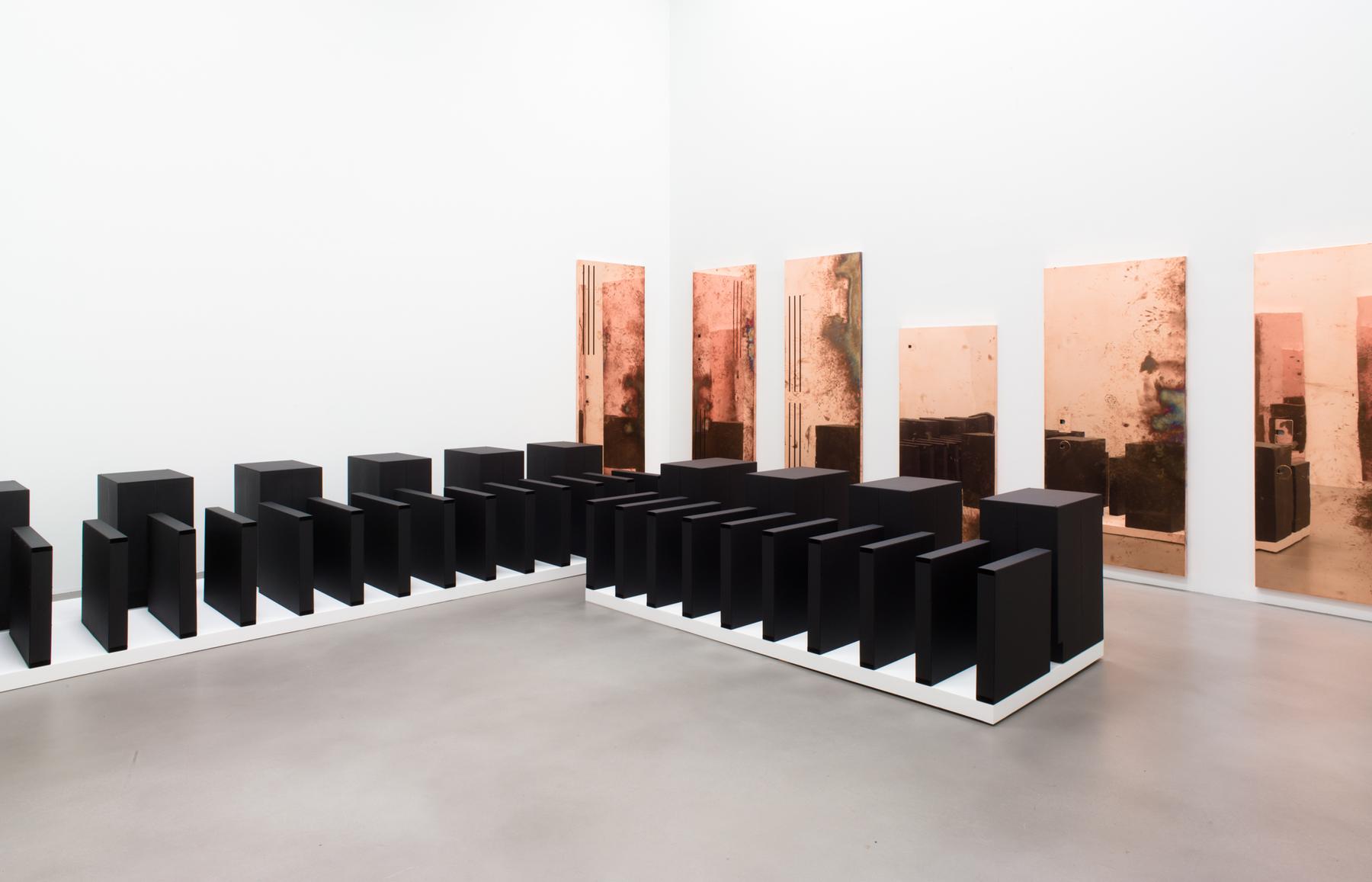 |
Walead Beshty
Performances Under Working Conditions
Installation view 20
2014
|
The press release states that Beshty "continues to explore the ways in which objects accrue and produce meaning through their placement and circulation in the world" (Petzel). Originally, these "Copper Surrogates" were tables and desks that gallery staff utilized in their normal everyday work activities. The marks on the polished copper table tops are indexes of the gallery staff's presence through traces of oil from their arms, hands and fingers or rings of condensation from beverages once consumed.
 |
Walead Beshty
Detail from Reception 2
2014
polished copper table top and powder-coated steel
31 x 81.875 x 1.5 inches
|
When I returned to the location to retrieve one of the benches, there were people sitting on them. They talked to each other, checked their cell phones-- someone even forgot a scarf on one of the benches. I felt as if I had just set up an impromptu, site-specific performance piece. The perceived status of the benches shifted from a discarded object to public seating just by a slight shift in presentation.
The same happened to these readymade copper table tops, but in this case, they went from an everyday commodity to a piece of art as a result of the artist's authority and their presentation in a gallery. Maybe if I was famous those benches would have turned into a work of art...
Courtland Thomas – Chelsea Gallery Walk Thru (9/18)
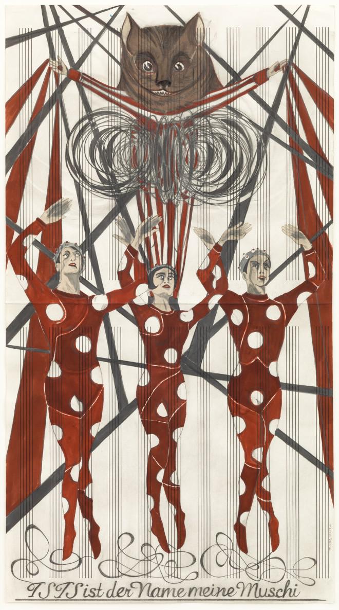
Can we talk about the huge vagina at the David Zwirner’s gallery?
Marcel Dzama’s Une Danse des Bouffons (A Jester’s Dance) left me stunned, shocked, and strangely subjective. The artist’s “Dadaist love story” stole my attention from what I had originally aspired to write about (Dzama’s Death Disco Dance, the television sets broadcasting a dance series in the middle of Guadalajara, Mexico on repeat).
After walking into Dzama’s installation, I was instantaneously transported into the modern recreation of Étant donnés’s romantic affair. Inside, mattresses with pillows invite guests to relax their bodies (and mind), in order to focus entirely on the film. The seats, built on foam material, aren’t exactly proper seating… however, I feel they somehow emphasize the architectural artistry within the film – sharp angles in the form of knives, a cutting-edge plot. The foam square compress when I sit down, making me fear sinkage, but also allow me to sink into the love story on-screen.
Within minutes into the film, I began to wonder what exactly constituted this as art. Une Danse was not far off from any of the videos my Computer Science friend makes – seemingly other-worldly, foreign, and not entirely straightforward about its purpose or mission (there’s a wonderment of… ‘what… IS this?’ throughout the entire film that keeps the viewers captivated). The main distinction between the films produced by Dzama and my Comp Sci friend were production levels; my friend doesn’t have access to Kim Kordan and Hannelore Knuts. Or weird papier-mâché vaginas.
In raising the question “what is art?,” Dzama’s installation can be considered an institutional critique. But is that an effect of contemporary art? The expansion of art types and mediums in the twenty-first century, due in part to the Information Revolution powered by microprocessors, has invited an open critique of what is included in contemporary art. Because definitions are relative to what the entities they define are not, perhaps a bigger question is to ask is... what is not art.
Monday, September 15, 2014
NAME CHANGE
Our amazing seminar recently changed its name to "Seminar in Contemporary Artistic Practice"... but we're the same class, looking, reading, traveling, talking and practicing...
Subscribe to:
Posts (Atom)